I have elevated the quality of Advalight’s digital content and website layout and enhanced the graphic production of various marketing resources. This has included optimizing website design, editing images and videos, handling adminstrative tasks and coordinating trade shows.
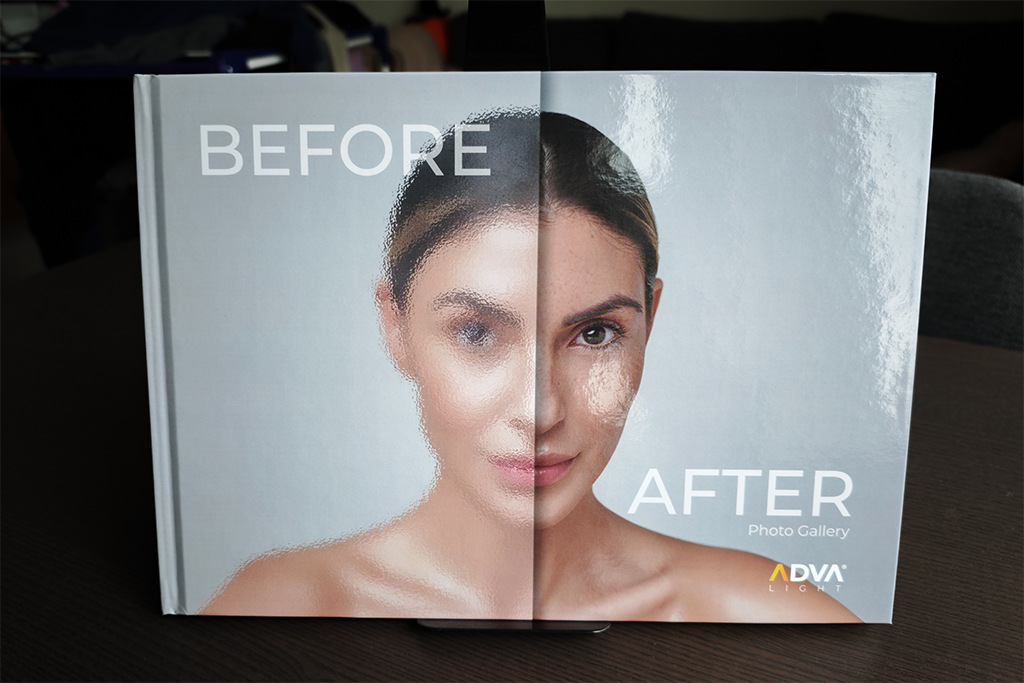
The approach for designing Advalight’s new visual identity was built around three core values: minimalism, luxury, and a medical feel. The goal was to evolve their brand without losing the visual connection to what they already had.
When it came to their merch, Advalight wanted a more clean, luxurious, and clinical look — while still making use of their signature color palette, but in a more subtle and refined way.
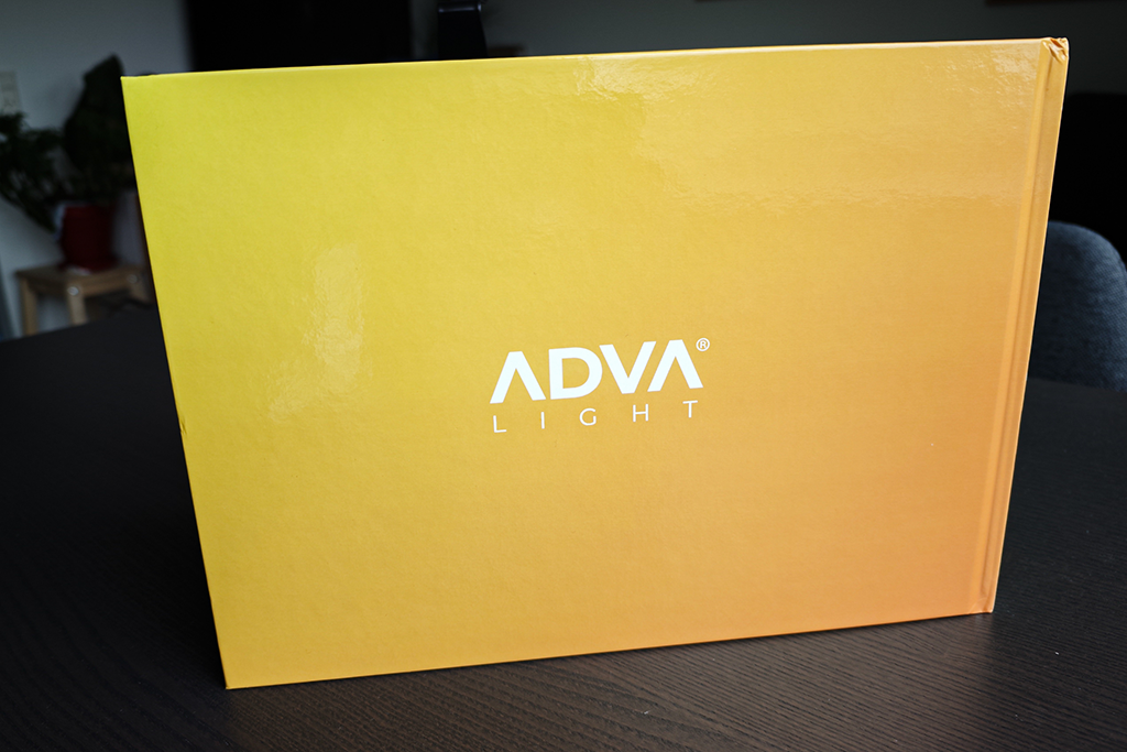
Yellow, in particular, can be a tricky color to work with, as it’s often associated with sales or discount messaging. To balance that out and elevate the overall look, I introduced gradients — a modern design trend that adds depth and sophistication, helping position Advalight’s identity as both premium and professional.
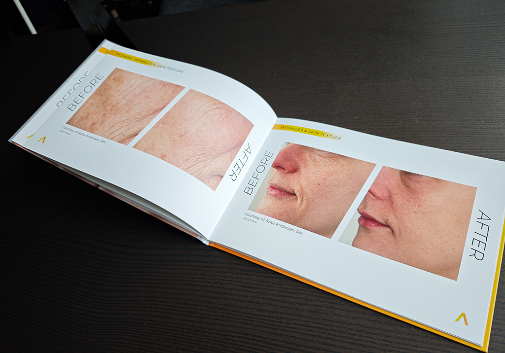
To further balance the boldness of yellow, I paired it with a neutral base of greys and whites, using yellow only in small details and accents inside the merch. This helped maintain brand recognition without overwhelming the design — creating a clean, high-end feel across their merch.
Results
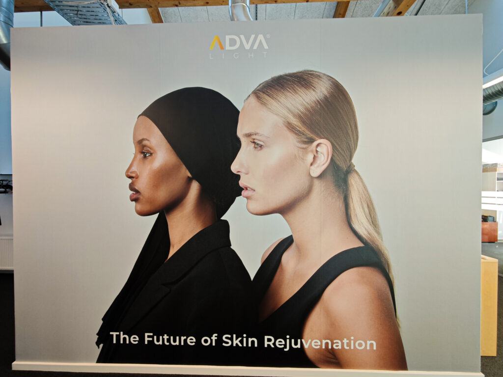
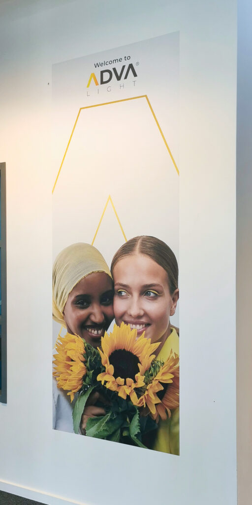
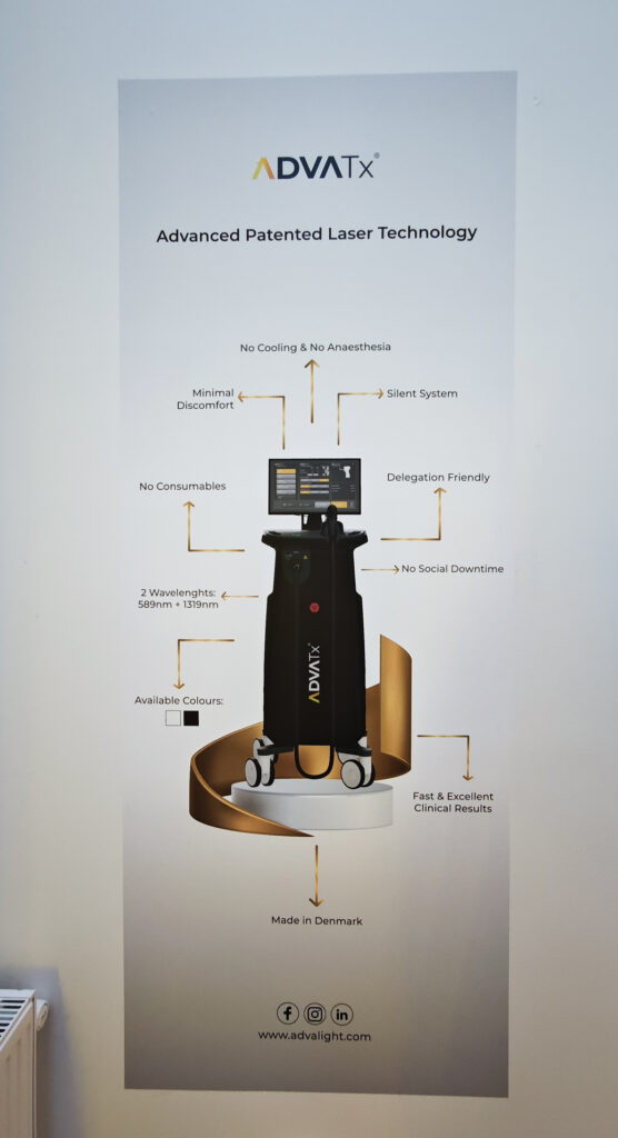
Wall posters
Wall poster ( 3,5 x 2 meters )
Wall poster ( 2 x 1 meters )
Wall poster ( 2 x 1 meters )
Book
Would you like me to spearhead the development of your upcoming concept?
Feel free to reach out to me here, and we can arrange a meeting over a cup of coffee